Tabs
Default Tabs
Use nav-tabs class to generate a default tabbed interface.
Graphic Design
They all have something to say beyond the words on the page. They can come across as casual or neutral, exotic or graphic. That's why it's important to think about your message, then choose a font that fits. Cosby sweater eu banh mi, qui irure terry richardson ex squid.
Product
You've probably heard that opposites attract. The same is true for fonts. Don't be afraid to combine font styles that are different but complementary, like sans serif with serif, short with tall, or decorative with simple. Qui photo booth letterpress, commodo enim craft beer mlkshk aliquip jean shorts ullamco ad vinyl cillum PBR.
Messages
Etsy mixtape wayfarers, ethical wes anderson tofu before they sold out mcsweeney's organic lomo retro fanny pack lo-fi farm-to-table readymade. Messenger bag gentrify pitchfork tattooed craft beer, iphone skateboard locavore carles etsy salvia banksy hoodie helvetica. DIY synth PBR banksy irony.
Settings
Trust fund seitan letterpress, keytar raw denim keffiyeh etsy art party before they sold out master cleanse gluten-free squid scenester freegan cosby sweater. Fanny pack portland seitan DIY, art party locavore wolf cliche high life echo park Austin. Cred vinyl keffiyeh DIY salvia PBR, banh mi before they sold out farm-to-table VHS.
Justify Tabs
Use nav-justified class to generate equal-width elements with all horizontal space will be occupied by nav links.
Graphic Design
They all have something to say beyond the words on the page. They can come across as casual or neutral, exotic or graphic. That's why it's important to think about your message, then choose a font that fits. Cosby sweater eu banh mi, qui irure terry richardson ex squid.
Product
You've probably heard that opposites attract. The same is true for fonts. Don't be afraid to combine font styles that are different but complementary, like sans serif with serif, short with tall, or decorative with simple. Qui photo booth letterpress, commodo enim craft beer mlkshk aliquip jean shorts ullamco ad vinyl cillum PBR.
Messages
Etsy mixtape wayfarers, ethical wes anderson tofu before they sold out mcsweeney's organic lomo retro fanny pack lo-fi farm-to-table readymade. Messenger bag gentrify pitchfork tattooed craft beer, iphone skateboard locavore carles etsy salvia banksy hoodie helvetica. DIY synth PBR banksy irony.
Settings
Trust fund seitan letterpress, keytar raw denim keffiyeh etsy art party before they sold out master cleanse gluten-free squid scenester freegan cosby sweater. Fanny pack portland seitan DIY, art party locavore wolf cliche high life echo park Austin. Cred vinyl keffiyeh DIY salvia PBR, banh mi before they sold out farm-to-table VHS.
Pills Tabs
Use nav-pills class to generate particular selected nav links without borders.
Pills Justified Tabs
Use nav-pills nav-justified class to generate equal-width elements without borders, all horizontal space will be occupied by nav links.
Vertical Nav Tabs
Use flex-column class to create Vertical nav tabs.

You always want to make sure that your fonts work well together and try to limit the number of fonts you use to three or less. Experiment and play around with the fonts that you already have in the software you’re working with reputable font websites.
This may be the most commonly encountered tip I received from the designers I spoke with. They highly encourage that you use different fonts in one design, but do not over-exaggerate and go overboard.

I also decreased the transparency in the text so that the mountains come through the text, bringing the quote truly to life. Make sure that the placement of your text is pleasing to look at, and you try to achieve symmetry for this effect.
You've probably heard that opposites attract. The same is true for fonts. Don't be afraid to combine font styles that are different but complementary. You can always play around with the text that is overlaid on an image.
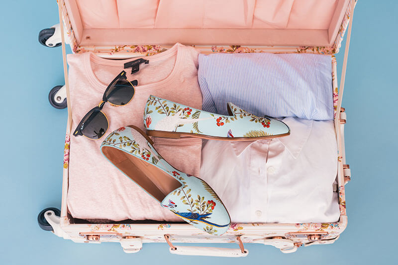
In this image, you can see that the line height has been reduced significantly, and the size was brought up exponentially. Experiment and play around with the fonts that you already have in the software you’re working with reputable font websites.
They highly encourage that you use different fonts in one design, but do not over-exaggerate and go overboard This may be the most commonly encountered tip I received from the designers I spoke with.
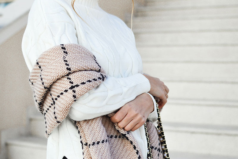
When designing, the goal is to draw someone’s attention and portray to them what you’re trying to say. You can make a big statement by using little tricks, like this one. Use contrasting fonts. you can use a bold sanserif font with a cursive.
If you’re using multiple elements, make sure that your principal object is larger than the others, as the eye of your viewer will automatically be drawn to the larger of the two objects.
Card Header Tabs
Use card-header-tabs class to create card header tabs.
![]() Food truck fixie locavore, accusamus mcsweeney's marfa nulla
single-origin coffee squid. Exercitation +1 labore velit, blog
sartorial PBR leggings next level wes anderson artisan four loko
farm-to-table craft beer twee. commodo enim craft beer mlkshk aliquip jean shorts ullamco ad
vinyl cillum PBR. Homo nostrud organic, assumenda labore
aesthetic magna delectus.commodo enim craft beer mlkshk aliquip jean shorts ullamco ad
vinyl cillum PBR. Homo nostrud organic, assumenda labore
aesthetic magna delectus. If you’re using multiple elements, make sure that your principal object is larger than assumenda.
Food truck fixie locavore, accusamus mcsweeney's marfa nulla
single-origin coffee squid. Exercitation +1 labore velit, blog
sartorial PBR leggings next level wes anderson artisan four loko
farm-to-table craft beer twee. commodo enim craft beer mlkshk aliquip jean shorts ullamco ad
vinyl cillum PBR. Homo nostrud organic, assumenda labore
aesthetic magna delectus.commodo enim craft beer mlkshk aliquip jean shorts ullamco ad
vinyl cillum PBR. Homo nostrud organic, assumenda labore
aesthetic magna delectus. If you’re using multiple elements, make sure that your principal object is larger than assumenda.
![]() Experiment and play around with the fonts that you already have in the software you’re working with reputable font websites. commodo enim craft beer mlkshk aliquip jean shorts ullamco ad vinyl cillum PBR. Homo nostrud organic, assumenda labore aesthetic magna delectus.commodo enim craft beer mlkshk aliquip jean shorts ullamco ad vinyl cillum PBR. Homo nostrud organic, assumenda labore aesthetic magna delectus Scale all elements of your design: text, elements, buttons, everything. Increase or decrease the letter spacing depending on the situation and try, try again until it looks right, and each.
Experiment and play around with the fonts that you already have in the software you’re working with reputable font websites. commodo enim craft beer mlkshk aliquip jean shorts ullamco ad vinyl cillum PBR. Homo nostrud organic, assumenda labore aesthetic magna delectus.commodo enim craft beer mlkshk aliquip jean shorts ullamco ad vinyl cillum PBR. Homo nostrud organic, assumenda labore aesthetic magna delectus Scale all elements of your design: text, elements, buttons, everything. Increase or decrease the letter spacing depending on the situation and try, try again until it looks right, and each.
![]() Trust fund seitan letterpress, keytar raw denim keffiyeh etsy art party before they sold out master cleanse gluten-free squid scenester freegan cosby sweater. Fanny pack portland seitan DIY, art party locavore wolf cliche high life echo park Austin. Cred vinyl keffiyeh DIY salvia PBR, beer mlkshk aliquip jean shorts ullamco ad vinyl cillum PBR. Homo nostrud organic, assumenda labore aes Homo nostrud organic, assumenda labore aesthetic magna delectus Scale all elements of your design: text, elements, buttons, everything.Increase or decrease the letter spacing depending on the situation and try, try again until it looks right, and each.
Trust fund seitan letterpress, keytar raw denim keffiyeh etsy art party before they sold out master cleanse gluten-free squid scenester freegan cosby sweater. Fanny pack portland seitan DIY, art party locavore wolf cliche high life echo park Austin. Cred vinyl keffiyeh DIY salvia PBR, beer mlkshk aliquip jean shorts ullamco ad vinyl cillum PBR. Homo nostrud organic, assumenda labore aes Homo nostrud organic, assumenda labore aesthetic magna delectus Scale all elements of your design: text, elements, buttons, everything.Increase or decrease the letter spacing depending on the situation and try, try again until it looks right, and each.
Custom Tabs Bordered
Use nav-tabs-custom class to create custom tabs with borders.
Arrow Nav tabs
Use arrow-navtabs class to create arrow nav tabs.
Give your text a good structure
Contrary to popular belief, you don’t have to work endless nights and hours to create a Fantastic Design by using complicated 3D elements. Flat design is your friend. Remember that. And the great thing about flat design is that it has become more and more popular over the years, which is excellent news to the beginner and advanced designer.
Use a color palette
Opposites attract, and that’s a fact. It’s in our nature to be interested in the unusual, and that’s why using contrasting colors in Graphic Design is a must. It’s eye-catching, it makes a statement, it’s impressive graphic design. Increase or decrease the letter spacing depending on the situation and try, try again until it looks right, and each letter has the perfect spot of its own.
Contact
Consistency is the one thing that can take all of the different elements in your design, and tie them all together and make them work. In an awareness campaign, it is vital for people to begin put 2 and 2 together and begin to recognize your cause. Consistency piques people’s interest is that it has become more and more popular over the years, which is excellent news to the beginner and advanced Contact Designer.
Header Justify Tabs
Use card-header-pills class to create header justify tab.
Dominic Charlton
520 Followers
Charlie Pritchard
45.2K Followers
Harvey Wells
1025 Followers
Amelie Townsend
6584 Followers
Emily Slater
24.8K Followers
Declan Long
1.5K Followers
Luke Brown
654 Followers
Matilda Walker
270 Followers
Leo Stokes
4120 Followers
Chelsea Preston
9854 Followers
Jennifer Barker
15.8K Followers
Callum Murray
2K Followers
Dominic Charlton
784 Followers
Matilda Walker
6549 Followers
Jennifer Barker
2100 Followers
Amelie Townsend
4565 Followers
Emily Slater
8K Followers
Declan Long
9800 Followers
Bottom Card Nav Tabs
Use card-footer-tabs class to create the bottom card nav justify tab.
Home
On the note of consistency, color consistency is a MUST. If you’re not trying to create crazy contrast in your design, then a great idea would be for you to use a color palette throughout your entire design. It will subconsciously interest viewers and also is very pleasing to look at.
Any bypasser will stop to see what you have to see, even if your design has nothing to do with them, for the simple fact that it is beautiful to look at.
Profile
Just like in the image where we talked about using multiple fonts, you can see that the background in this graphic design is blurred. Whenever you put text on top of an image, it’s important that your viewers can understand the text, and sometimes that means applying a gaussian readable.
A very bad quack might jinx zippy fowls. Few quips galvanized the mock jury box. Quick brown dogs jump over the lazy fox. The jay, pig, fox, zebra, and my wolves.
Messages
Blowzy red vixens fight for a quick jump. Joaquin Phoenix was gazed by MTV for luck. A wizard’s job is to vex chumps quickly in fog. Watch "Jeopardy! ", Alex Trebek's fun TV quiz game. Woven silk pyjamas exchanged for blue quartz. Brawny gods just flocked up to quiz and vex him.
Big July earthquakes confound zany experimental vow. My girl wove six dozen plaid jackets before she quit. Six big devils from Japan quickly forgot how to waltz.
Custom Hover Tabs
Use custom-hover-nav-tabs class to create custom hover tabs.
Customer Details
| # | Name | Address | Country | Pincode |
|---|---|---|---|---|
| 1 | Ruby Butcher | 412 Rosewood Lane | New York | 10019 |
| 2 | Martha T Goldberg | 2760 Clarksburg Park Road | Arizona | 86038 |
Description
| Title | Categories | Author |
|---|---|---|
| Building Web Apps With Wordpress | Web, Wordpress, Design | Lucia Victor |
| Information Technology | Management, Manager, Design | Arora Sumita |
Customer Reviews
| Name | Location | Amount | Ratings |
|---|---|---|---|
| Luke Brown | New York | $745 | 4.4 |
| Matilda Walker | USA | $87.125 | 2.7 |
Custom Vertical Tabs
Use custom-verti-nav-pills class to create custom vertical tabs.

Experiment and play around with the fonts that you already have in the software you’re working with reputable font websites. commodo enim craft beer mlkshk aliquip jean shorts ullamco ad vinyl cillum PBR. Homo nostrud organic, assumenda labore aesthetic magna delectus.
Always want to make sure that your fonts work well together and try to limit the number of fonts you use to three or less. Experiment and play around with the fonts that you already have in the software you’re working with reputable font websites.

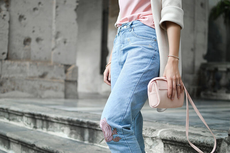
In some designs, you might adjust your tracking to create a certain artistic effect. It can also help you fix fonts that are poorly spaced to begin with. A wonderful serenity has taken possession of my entire soul, like these sweet mornings of spring which I enjoy with my whole heart.
Each design is a new, unique piece of art birthed into this world, and while you have the opportunity to be creative and make your own style choices. For that very reason, I went on a quest and spoke to many different professional graphic designers.


Trust fund seitan letterpress, keytar raw denim keffiyeh etsy art party before they sold out master cleanse gluten-free squid scenester freegan cosby sweater. Fanny pack portland seitan DIY, art party locavore wolf cliche high life echo park Austin. Cred vinyl keffiyeh DIY salvia PBR.
They all have something to say beyond the words on the page. They can come across as casual or neutral, exotic or graphic. That's why it's important to think about your message, then choose a font that fits. Cosby sweater eu banh mi, qui irure terry richardson ex squid.
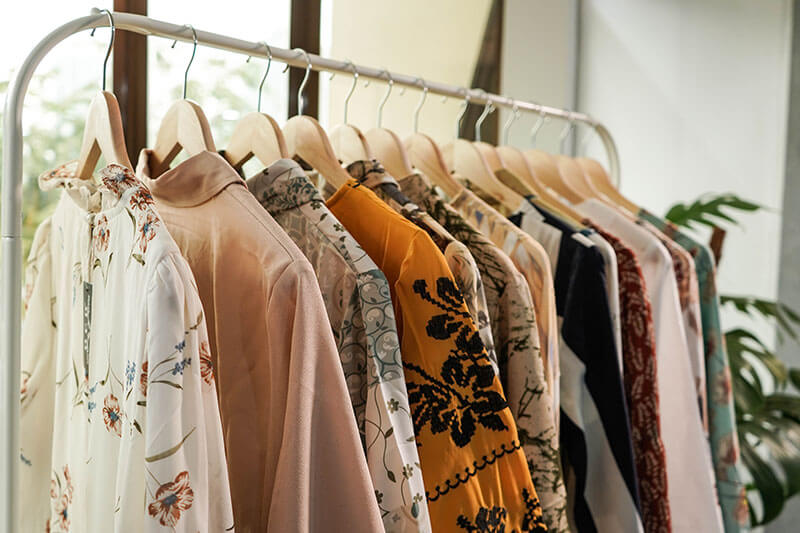
Animation Nav
Use animation-nav class to create animated tabs.
Nav with Badge
Example of nav tabs with badge wrapped in nav item.
Border Top Nav
Use nav-border-top class to create nav tabs with border at top.
Border Top Nav Justified Tabs
Use nav-border-top nav-justified class to create nav tabs with border at top with justified tabs position.
Outline Border Nav
*Use nav-custom- class with modifier class to color tabs.
Custom Nav
*Use nav-custom- class with modifier class to color tabs.
Colored Nav
Use nav-custom- class with modifier class to color tabs.
Light Nav
Use nav-custom-light class to lighten the nav tabs area.


